Introduction
Apart from your experience and qualifications, that which catches into the eyes of hiring managers in the very beginning is the sort of font one will choose for their resume. Indeed, all the difference sometimes is made about resume fonts. The right one in 2025 may get you one step closer to the interview or, on the other end of the stick, pass you on the interview line.
Why is font so important? The choice of font affects readability, which in turn influences how easily hiring managers can review your qualifications. A clean and professional font shows that you take your application seriously, whereas an untidy or overly decorative font will make your resume appear unprofessional. Besides, resume fonts work very significantly in your personal branding. Think of this like that: if a resume were a person, the font would be its first impression.
Let’s Discover How Choosing the Right Resume Fonts Can Upgrade Your Resume Leaving a Lasting Impact.
Why Font Matters in Your Resume?
The selection of a font goes beyond aesthetics; it carries with it psychological traits that govern how your resume is perceived. Here are the top reasons why the choice of font matters:
How Resume Fonts Impact Hiring Managers’ Decisions
First impression indeed does count in hiring. A hiring manager reviews the resume of which they will always form an opinion about you even before meeting face to face with you. Organized and highly professional fonts have a certain characteristic of neatness and quality to them. For example, an uncommon or difficult font may be suggestive of overthinking or that perhaps you do not understand the basic fundamentals of the presentation of professionalism.
How Font Choice Affects Resume Readability
Many hiring managers only scan resumes, especially when they have to go through a bunch in one day. Selecting a readable font ensures that your qualifications and experience are noticeable without any visual clutter. Readability is paramount-if the font is too decorative, too tiny, or not legible, your resume will get tossed onto the pile before it gets an honest look.
How Fonts Influence First Impressions on Your Resume
Every time someone opens and looks at your resume, often, that is the first impression people will get of your work. The choice in font impacts how professionally that first impression reads and shows an eye for detail. Think about an old, awkward font used for a resume-not very professional looking. Instead, it might say, “I did not bother to pick a better font.”
Top 10 Resume Fonts for 2025
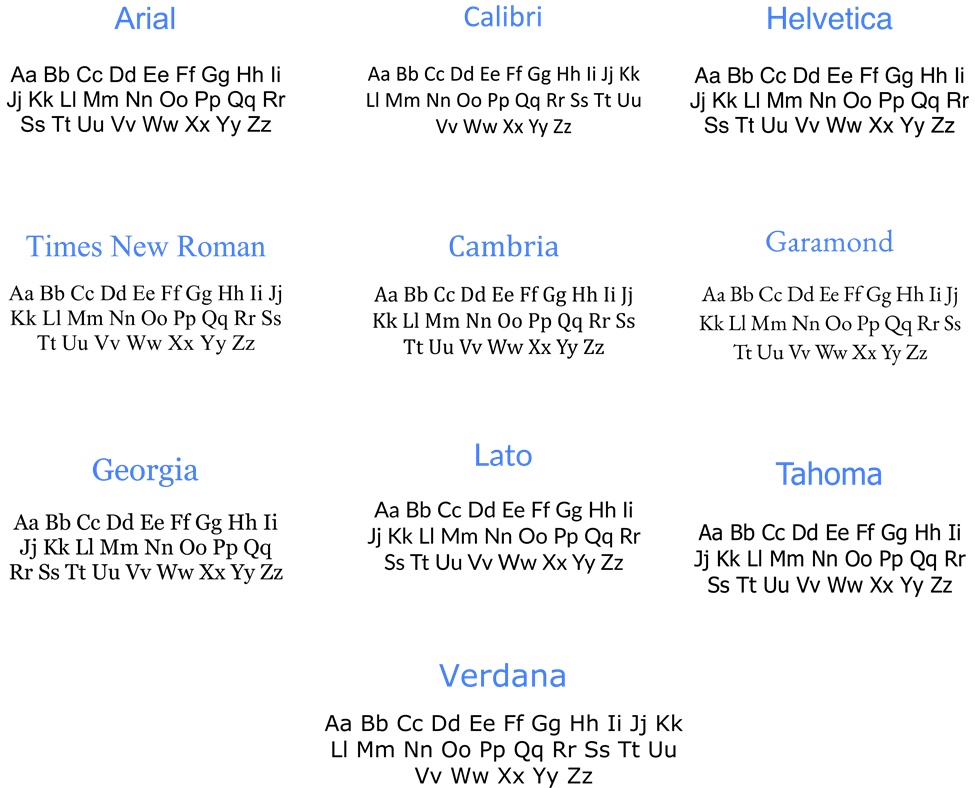
Having our knowledge on the right choice of font, it’s time to give you a comprehensive list of top 10 resume fonts to present you amazingly well in 2025. Each of the listed fonts is known for their great readability, professionality, and general looks and feels of it on a resume.
1. Arial
Arial is a font that many people use, and there are good reasons for that. It’s straightforward, readable, and simple to read. If you’re doubtful about which font to pick, this is a reliable option. It’s commonly accepted across various industries, making it a solid choice for your resume.
2. Calibri
Calibri is a very widely used font because it was the default font in Microsoft Word. The font is flat and modern, with a very clean, very readable design. One of the finest fonts for a professional resume is Calibri, especially for the tech and corporate world.
3. Helvetica
Helvetica is a classic sans-serif font that is perfect for resumes. Its clean and neutral look makes it highly recognizable. This font is particularly effective for applications in design, tech, or creative industries, as showcases your understanding of modern design concepts.
4. Times New Roman
Though old-fashioned, Times New Roman remains one of the most professional fonts existing. If you are seeking a job in a profession like law, finance, or academia, then it is likely your best choice. Its traditional look, readability, and professionalism make it a good option.
5. Cambria
Cambria is a great font-it’s an oldie but sounds modern in style. This is a serif font, making this appear rather antique but a little more contemporary than Times New Roman. This is an excellent font for any person who wishes to achieve a look that is mostly professional yet not overly aged.
6. Garamond
Garamond stood the test of time, as it is due to a certain reason. They are stylishly professional and show a touch of elegance over and above the fonts that are mainly practical. When you work on a creative task or when a resume has more elegance to give, this kind of font truly works.
7. Georgia
Georgia is a serif font, and it does provide beauty with some sort of modern style along with improved readability on screens as compared to other serif fonts. It feels easier going than Times New Roman while keeping a very professional face. Therefore, it makes for an excellent choice for resumes in all industries.
8. Lato
Lato is a modern sans-serif typeface with great legibility. It can be used in marketing, tech, and design resume fields. It emits an approachable, clean, and professional feel with a relaxed tone.
9. Tahoma
It is a clean sans-serif with some slightly wider letter spacing that gives your resume that more open feel. It seems to easily read well on all devices, making it more popular among those writing in the corporate and the tech world.
10. Verdana
It is created specifically for viewing on the computer screen and probably one of the most readable typefaces in this modern digital age. Therefore, it’s great for computer-screen monitored resumes as viewed on tablets, smartphones, and computers. Being a tad wider than some other typefaces, still it would be ideal for your resume.
Serif vs. Sans-Serif: Which Font is Best for Your Resume?
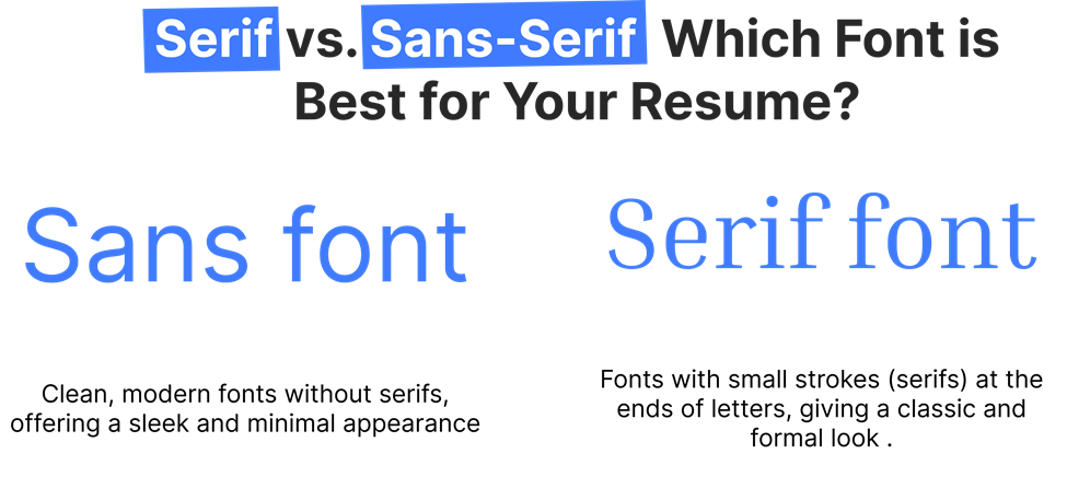
During writing of resumes, you encounter “serif” and “sans-serif” fonts. What are serif and sans-serif fonts and which one will be good for your resume?
Serif Fonts
Serif fonts are marked by small decorative lines called “serifs” at the end of their strokes. They tend to be formal in nature and are mainly used for print. Examples of serif fonts include Times New Roman and Garamond. These will give your resume a classic, formal look ideal for law, academics, and finance practices.
Sans-Serif Fonts
Sans-serif fonts have no extra lines at the edges of their strokes. They seem to be newly printed and streamlined. Examples for sans-serif include Arial, Calibri, Helvetica. These are the most suggested typefaces by the tech, marketing, and design industries which are more about being modern and clean.
Which One Should You Choose?
Both these are great fonts for resumes, but your decision will entirely depend on the type of industry you’re looking to get hired into. If you’re in creative industries, then Helvetica or Lato would be the better sans-serif font. In legal or financial fields, for example, Times New Roman will be the better choice.
Fonts to Avoid on Your Resume
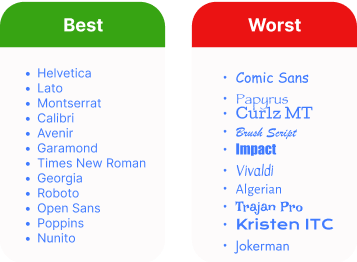
Even with the best qualifications, a wrong choice of font can make your resume look unprofessional. Here are some fonts to avoid:
Comic Sans
The widely absurd Comic Sans should never appear on your resume. It is playful and informal, often associated with casual projects rather than professional ones. To project professionalism, opt for more neutral fonts.
Papyrus
It is a little artsy, but it is an older font and is used more loosely. It does not work too great with resumes, as it tends to subdue the professional aspect of your application.
Curlz MT
If you wish to attract attention, Curlz MT will certainly attract attention-but to the wrong end. It just looks so awkward, illegible, and so unprofessional. There are ways of attracting more attention: possibly highlighting your credentials rather than your font.
The Best Font Size for Your Resume
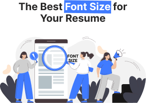
The ideal font size for your resume is very important. The right size will ensure that your resume will be readable and have all the details in the document. If the text is too small, hiring managers will not be able to read your qualifications. On the other hand, if it’s too large, it looks unprofessional and wastes precious space on it. Ideal Font Sizes for Different Sections:
Ideal Font Sizes for Different Sections:
1. Header (Name & Contact Information): Your name is the first thing a recruiter will notice. Make sure that it is truly the first, so set your name in text size around 18–22 points. Other contact information, such as phone, email, and LinkedIn, is often set below your name and is acceptable at sizes of 10–12 points.
2. Headings (e.g., Professional Experience, Education): Headings only-may be in the same size and font as the body text. A font size of 12–14 points should do the trick-for it should be large enough to get attention without mess and disarray.
3. Body (Job Descriptions, Skills, etc.): The word count ideal for the body section is 10–12. Any less will strain the reader’s eyes, and any more will use up too much space and dilute the impact of your resume’s content.
4 . Subheadings or Minor Sections (Skills, Certifications): 10.5–11 points, a bit smaller than your body text. This will keep sub-sections from overwhelming more important content, yet still seem organized.
5 . Balancing Readability and Space: You want to achieve a balance between making it readable and all your information fitting onto one page, or two, if necessary. Use body text in anything smaller than 8 or 9 points; it makes your resume really hard to read, which is the opposite of what you want when trying to grab at the reader.
6. Formatting Tips for Font Size: Here’s how you can make your font size work for you:
- Consistency is Key: Keep the same font size for similar sections.
- White Space is Valuable: Avoid filling the page with text. Proper use of white space allows the reader to navigate your resume easily and creates room for the important sections to shine.
How to Match Your Resume Font with the Industry

When selecting a font, it’s important to consider how it fits within your industry. Each sector has its own standards regarding what is judged professional or creative. By aligning your font choice with the industry you’re targeting, you show that you grasp the culture and expectations of that field.
1. Creative Industries (Design, Advertising, Media):
In creative industry sectors for a resume, there is every license to push a little to a more artist or even eloquent take it’s still quite tasteful while retaining creativity or personality. Now the modern art or artistic but with no sacrosanct feel for reader comfort can best be achieved, such as is done by, with Helvetica and Futura along with Garamond. While for slick-look modern touch, Lato shines.
Example: In creative industry sectors for a resume, there is every license to push a little to a more artist or even eloquent take it’s still quite tasteful while retaining creativity or personality. Now the modern art or artistic but with no sacrosanct feel for reader comfort can best be achieved, such as is done by, with Helvetica and Futura along with Garamond. While for slick-look modern touch, Lato shines.
2. Corporate and Financial Sectors:
The world of the corporate office is very elegant and well-groomed. Times New Roman, Arial, and Calibri are staple fonts. Traditional fonts used speak of knowledge and gravity.
Example: A corporate lawyer could use Times New Roman in size 12 for the main text of their resume, with Arial or Calibri for headings to introduce a modern touch.
3. Tech Industry:
For the tech industry, simplicity and clarity are always preferred. Clean, modern fonts like Verdana or Tahoma are perfect for this reason. These are readable even at smaller sizes, which makes them perfect for coding or technical resumes.
Example: A software engineer might choose Verdana for readability and maintain consistent formatting to emphasize his coding skills.
4. Healthcare and Education:
In healthcare or education, the professional font has to be readable. Best options include Cambria, Georgia, and Arial since they seem professional but not so stiff or formal.
Example: A nurse may choose a very readable and approachable font to make reading her resume pretty easy.
Best Fonts for a Resume: How to Choose the Right One
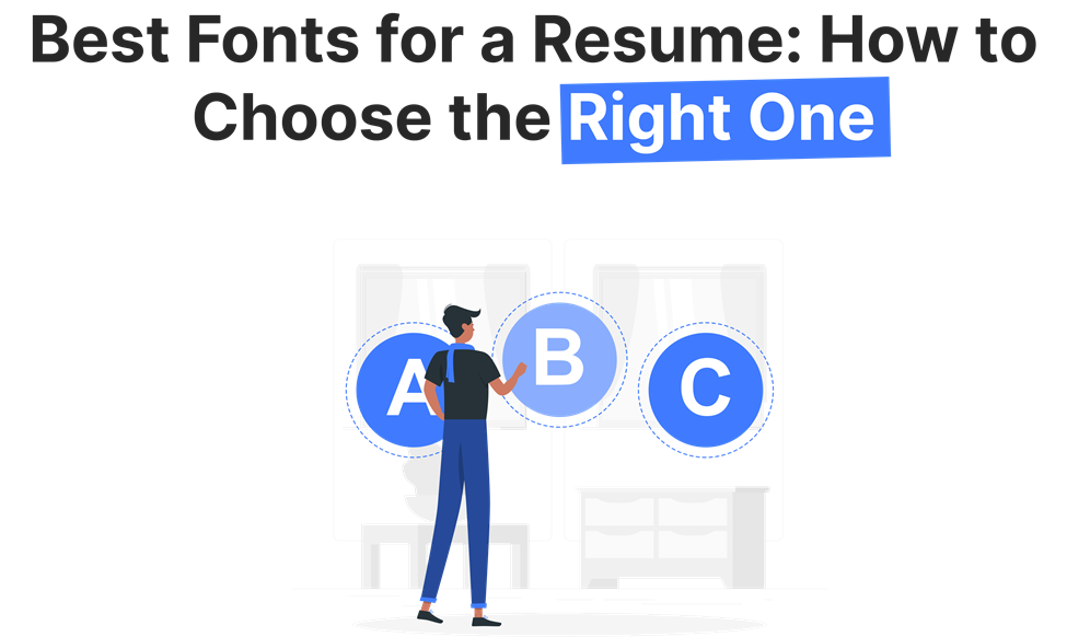
You have to choose the best font for your resume. Though it should look attractive, it should also be readable and aligned. A good font makes your resume scannable and readable to both human eyes and the Applicant Tracking Systems (ATS), most of which filter what reaches the recruiter at their end.
1. Select a readable font-Need for clarity:
The first and most critical role of a resume font is that it should be readable. The more decorative the font, no matter how beautiful or intricate it may look, the more confusing to the reader, or just too hard to decipher, it is. Instead, go for something clear and readable. The basic fonts that are perfect include Calibri, Arial, and Georgia.
2. Professionalism – The Font Should Reflect Professionalism:
Consider a resume as the presentation of professional identity. An appropriate font reflects the right impression. Though old-fashioned, Times New Roman still is considered extremely professional in a lot of professions. Helvetica works well for those who are trendy and new and want to showcase their tech business or startup companies.
3. Ensure Compatibility with ATS (Applicant Tracking Systems):
Many companies use an ATS in which resumes are scanned and culled down to the most relevant candidates through keywords. Some fonts are easier for an ATS than others. Generally, serif such as Times New Roman and Cambria read smoothly to the ATS, while sans-serif such as Arial and Helvetica review pretty easily.
Example: When you are applying online, make sure that you use fonts that do not confuse the ATS. Opt for commonly used fonts such as Arial and Calibri to get maximum compatibility.
Resume Formatting Tips: Choosing the Best Font for Readability
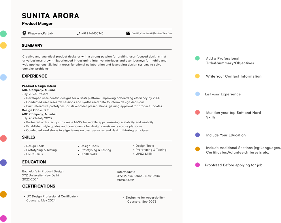
Creating a resume that is both visually appealing and functional requires proper formatting. Here are some tips to help you format your resume effectively using the right font:
1. Margins: Target for margins of about 0.5–1 inch. This keeps your resume from feeling cramped while ensuring a tidy look.
2. Spacing: Apply single spacing for the body text and double spacing between sections. This results in a clean and easy-to-read format.
3 . Headers: Use bold or slightly larger font sizes for section headers (12–14 points). This allows recruiters to quickly scan your resume.
4. Consistency: Stick to one font throughout the resume. Using multiple fonts can create a disorganized appearance.
5. Bullet Points: Use bullet points for lists. They enhance readability and help to break up lengthy paragraphs.
The Impact of Font Color on Your Resume
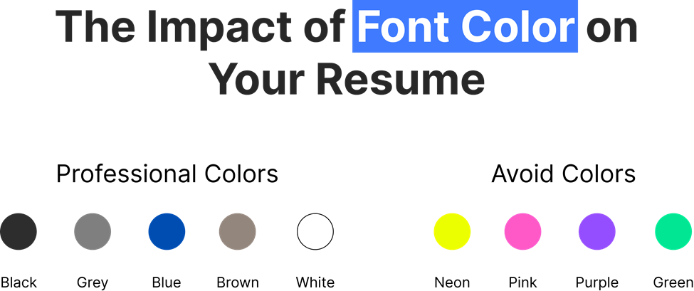
While traditional black font is the safest choice, adding a touch of color can make your resume more eye-catching—if done carefully.
1. Keep it Subtle: Use color in moderation. For example, a soft blue or dark gray can work well for section headers, but avoid neon or overly bright colors that could distract the reader.
2. Highlight Key Sections: Think about using color to highlight your name, job titles, or section headers. A professional resume color palette usually features shades of blue, gray, or even dark green.
Example: A marketing professional might choose navy blue for their section headers to achieve a consistent, polished appearance that matches with the corporate brand.
Resume Font Mistakes to Avoid for a Professional Look
We’ve discussed how to select the right font, but there are several common mistakes that job seekers often make regarding fonts. Avoiding these mistakes can improve your chances of securing an interview.
1. Using Hard-to-Read Fonts: Fonts such as Comic Sans or Papyrus should be completely avoided. They can make your resume appear unprofessional and fail to reflect the seriousness of your qualifications.
2. Inconsistent Font Choices: Changing fonts between sections or using various fonts for emphasis can clutter your resume. It’s best to stick to a single font from start to finish.
3. Too Small or Too Large Font Sizes: Fonts that are too small (below 10 points) can be difficult to read, while excessively large fonts may come off as unprofessional. Target for the suggested sizes for a balanced look.
4. Overuse of Bold and Italics: Although bold and italics can effectively highlight key information, overusing them can be distracting. Use these styles rarely.
How the Right Font Can Set Your Resume Apart
To make your resume noticed, use formatting tools like bold, italics, and varying font sizes to highlight important information.
1. Bold for Emphasis: Use bold to highlight key headings, job titles, and companies to make sure that they grab attention.
2. Italics for Details: Italics can be used for job dates or additional details that are still important but shouldn’t overpower the main text.
3. Different Font Sizes for Hierarchy: Make job titles slightly larger than the body text to show the structure and importance of each section.
Conclusion
In 2025, the right font for your resume will be one that balances readability, professionalism, and practicality. A suitable font will make your resume easy to read, well-organized, and in line with your career aspirations. Always tailor your choice of font to the industry you’re targeting and keep to the formatting guidelines.
A good choice of font will make all the difference by attracting hiring managers to your resume.
Call-to-Action
Optimize Your Resume Today! Choose the perfect font to boost readability and leave a lasting impression https://lookingforresume.com/
FAQ
1. What font is best for a resume in 2025?
The best fonts for a resume in 2025 are clear and professional. Options like Arial, Calibri, and Helvetica work well across industries.
2. What is the best resume format for 2025?
The best format for 2025 resumes includes a clean, organized structure with sections like contact info, experience, education, and skills, all laid out in a readable, consistent font.
3. What is the most attractive font for a resume?
Attractive fonts are those that are easy to read and convey professionalism. Helvetica and Calibri are both highly regarded.
4. Should a resume be 11 or 12 fonts?
Font size should generally be 11 or 12 points. This ensures readability without overwhelming the page.
5. Is Calibri 11 good for resume?
Yes, Calibri 11 is a great font choice. It’s easy to read and commonly used in professional settings.