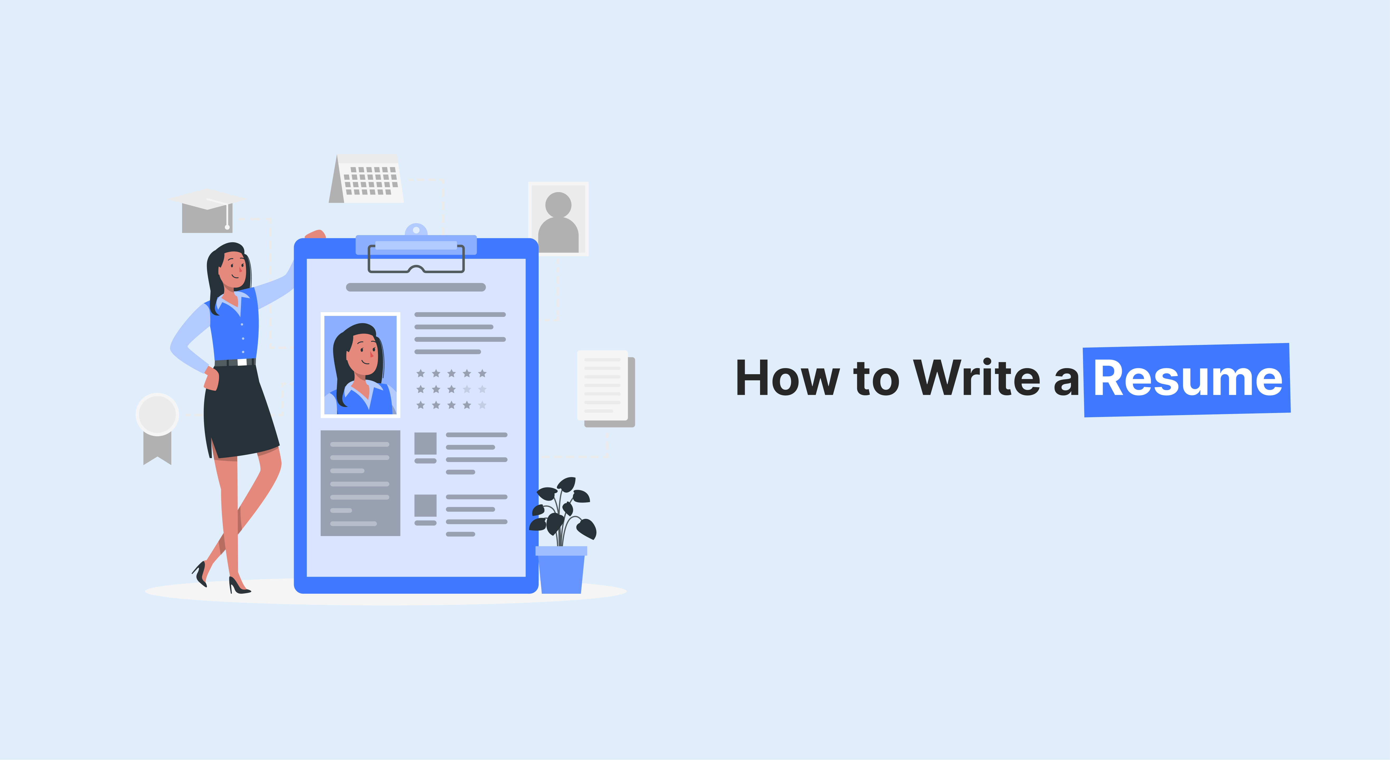
Introduction
It not only contains the list of all your career achievements and skills but also presents an image of your professional journey. Sometimes, it can even be the first impression of you that would be presented before your potential employers. In today’s competitive market, resume formatting is crucial to ensuring your qualifications are effectively highlighted. A well-presented resume design can make a significant difference in catching the attention of recruiters.
Resume Formatting plays an important role in how your resume is observed by both human readers and Applicant Tracking Systems (ATS). Despite whether you’re seeking a senior-level position or just beginning your career, the layout of your resume can significantly impact your chances. A well-structured resume format can be the deciding factor in securing that dream job.
This blog will guide you through 9 expert tips on how to format a resume that stands out in a competitive job market. From the right choice of font to having a resume ready for the automated match systems used by most companies, these expert tips will help create a polished and professional resume that catches the eye of any hiring manager.
Overview of Professional Resume Formatting
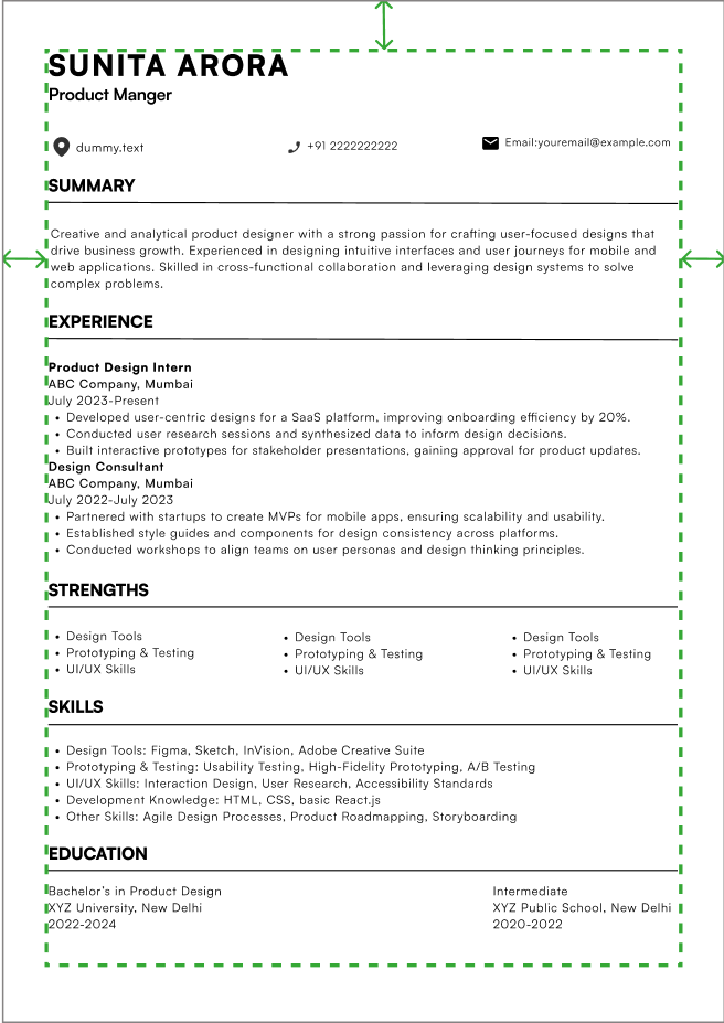
Key Elements of a Professionally Formatted Resume
We know what it looks like: this is professional formatting for a resume. This concerns the look and legibility of the paper itself. A professionally formatted resume to keep guidelines in which one can easily find and identify qualifications at a glance.
Why Resume Formatting Matters for ATS and Hiring Managers
Because both ATS as well as human hiring managers use formatting to help them quickly scan in and out to whether your resume makes the cut in their position or not. ATS stands for applicant tracking system, which is the software that companies are using for scanning resumes before they even send them on to human reviewers. It will be hard for the ATS to read because of the very poor formatting of a resume, and this way your resume will end up being passed on. A very simple and clean layout would ensure that the information on the ATS will not be hard to interpret in order to increase one’s chance of getting an interview.
A professional resume format makes it easier on the reader. It will point out your achievements while still making the document look organized. Your goal in resume writing is to make it easy on the reader to read-either on an ATS or when a hiring manager reads it.
1.Best Resume Formatting Tips: Choosing the Right Fonts

Why Resume Font Choice Impacts Hiring Decisions
This might make reading your resume as painless for them as you intend it to be. In any case, what you have is a typeface that’s more likely than not to be quite professional and certainly legible. Avoid the need for them to struggle over confusion or distractions born of bad choice by using one of these even attractive and not cluttered.
A good choice of a font will ensure that your resume is clean and well-arranged, especially when room is scarce and you want to highlight your credentials. A legible and readable font, coupled with sufficient spacing and proper formatting, help present your skills and experience.
Best Font Types for Resumes
There are two main types of fonts to consider: Serif and Sans-serif.
- Serif Fonts (like Times New Roman) have small lines or “serifs” at the ends of each letter stroke. They’re considered traditional and professional.
- Sans-serif Fonts (like Arial or Helvetica) do not have these lines. They are considered cleaner and more modern.
When to Choose Each Font Type:
- Serif fonts are best used in more formal industries, such as finance, law, or academia.
- Sans-serif fonts work well for creative fields like marketing, design, or technology, where a modern and sleek look is appreciated.
Recommended Font Sizes
The recommended font size for body text is between 10 and 12 points, while headings should be set at 14 to 16 points. This balance helps maintain readability without making the resume feel cramped or too spread out. It’s best to avoid larger sizes, as they can make your resume look unprofessional or unnecessarily lengthy.
Font Color and Style
While black is the standard and most reliable choice, opting for dark gray can create a more subtle appearance. Steer clear of bright or flashy colors, as they may come across as unprofessional.
Also, keep your fonts straightforward. Limit yourself to one or two font styles to ensure a tidy and organized look.
2.Best Resume Color Schemes for a Professional Look
How to Use Color Effectively
Color use will add flair to the otherwise potent content of your resume. Of course, do not overdo the color, and a keen choice of color can make your resume truly stand out as being attention-grabbing.
For instance, using color to draw focus on your headings or important skills but avoiding very bright colors that may draw attention away from the content itself. Typically, a muted, rich color palette is usually best.
Recommended Color Palettes for Professional Resumes
- Black, White, and Gray: These classic colors will never go out of style. They’re clean, formal, and professional.
- Navy, Dark Blue, or Burgundy: These colors work well for headings and subheadings, adding a bit of character while remaining professional.
Colors to Avoid
Bright colors like neon greens, reds, or yellows should be avoided entirely. They may make your resume look unskilled and unprofessional.
3.Resume Formatting Best Practices for Margins and Spacing
The layout of your resume should ensure that content is evenly spaced and easy to read. Margins and spacing are key elements that contribute to this.
Standard Page Margins
The standard margin size is set to 1 inch on every side of the page. This ensures a tidy and balanced look, preventing your content from feeling cramped.
Proper Line and Paragraph Spacing
Sufficient line spacing (1.15 or 1.5) ensures that the text doesn’t look too cramped. A well-spaced resume is easier to read, making it more likely that the hiring manager will notice your skills and experience. Proper spacing between sections also helps break up the text, guiding the reader through the document.
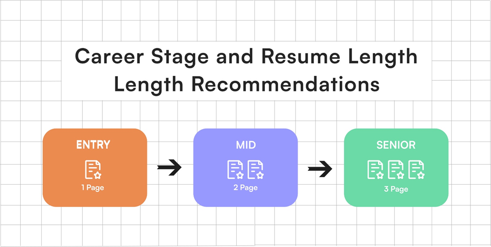
4.Ideal Resume Formatting: One Page or Two?
A common debate in resume writing revolves around whether to keep your resume to one page or to extend it to two pages. Although there isn’t a one-size-fits-all answer, here are some tips to think about:
-
One Page:
Ideal for entry-level candidates or those with less than 5-7 years of experience. A concise one-page resume shows your ability to effectively summarize your qualifications.
-
Two Pages:
For candidates with extensive experience or higher-level positions (10+ years). A two-page resume allows you to provide more detailed descriptions without overfilling the page.
5.Resume Formatting Strategies: Organizing Your Resume for Maximum Impact
Organize Your Resume for Easy Guidance
There may not be much time at the end where hiring managers sit through resumes one by one, reading every small detail. Good section headings will enable them to pick out your skills, experience, education, and certificates quickly. Have a neat resume with relevant bold headings before each section.
Recommended Headings
- Experience
- Education
- Skills
- Certifications
These are standard headings that are universally recognized by ATS and hiring managers alike.
6.How Bullet Points Improve Resume Formatting and Readability
How to Present Work Experience Clearly
Using bullet points instead of long paragraphs helps break down your work experience into small sections. Hiring managers can easily scan your job responsibilities and accomplishments, making it more likely they’ll take a second look.
Benefits of Using Bullet Points
- Easier to read
- Emphasizes key accomplishments
- Allows for more concise descriptions
How to Write Effective Bullet Points
Focus on measurable achievements—for example, “Increased sales by 30% in six months” rather than vague statements like “Responsible for sales.”
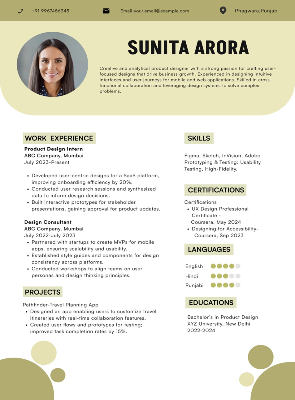
7.Why Resume Formatting Should Avoid Fancy Graphics or Images
The Dangers of Using Visual Elements in Your Resume
While it might be tempting to add graphics or images to make your resume more presentable, they tend to have a counterproductive effect. Graphics confuse the ATS systems, and in extreme cases, the resume might end up being read incorrectly or outright rejected.
When Graphics May Be Acceptable
In certain creative fields like graphic design or marketing, incorporating a small logo or graphic may work in your favor. However, even then, use graphics minimally.
8.ATS-Friendly Resume Formatting: How to Optimize Your Resume for Applicant Tracking Systems
Making Your Resume ATS-Compatible
Applicant Tracking Systems (ATS) are used by numerous companies to filter resumes before they reach a human reviewer. Making sure your resume is compatible with ATS is very important for getting through the initial screening.
Key ATS-Friendly Tips
- Use standard fonts (Arial, Helvetica)
- Stick to standard headings like “Experience,” “Skills,” and “Education”
- Avoid text boxes, tables, or unusual formatting
9. Resume Formatting Checklist: Avoiding Common Mistakes
Eliminating Errors and Inconsistencies
Finally, it’s important to proofread your resume for any errors. A resume that contains spelling mistakes or has inconsistent formatting can leave a negative impression.
Common Formatting Errors to Check For
- Inconsistent font sizes
- Misaligned text
- Missing periods or punctuation errors
Additional Formatting Tips
10.Best File Formats for Resume Submission
When submitting your resume, the file type you choose is important. PDF is the most widely accepted format because it maintains your formatting and appears professional. However, it’s always a good idea to check the employer’s preferences before sending it in.
11.Resume Headings That Improve ATS Compatibility
Using standard resume sections helps ATS in understanding the content of your resume. This boosts your chances of passing the initial ATS scan and getting noticed by a hiring manager.
Conclusion
You must present your resume to look as professional as possible in order to have the chance of good impressions. According to these grounds of considerations, you could write an easy-to-read resume for humans as well as friendly, not complicated ones towards friendly and user-friendly, simple for friendly reader ATS. It is always in your best interests to focus on your simple clarity with consistence: all the requirements combined should ensure to perfect the manner by which qualifications would be presented. Present it right!
Call-to-Action
Land your dream job with a job-winning resume! Build a polished, ATS-friendly resume effortlessly at https://lookingforresume.com/ – Try it free today!
FAQs
1. Should you include a photo on your resume?
While certain industries, like modeling or acting, might find the photo beneficial, in most professional fields, including a photo is often unnecessary and can even be distracting.
2. How many bullet points should you use for each job?
Aim for 4-6 bullet points per job, focusing on key accomplishments and measurable results.
3. What is the best resume length?
If you have less than 7 years of experience, one page is usually sufficient. Those with more experience may opt for a two-page format.
4. What font is best for a resume?
Sans-serif fonts like Arial or Helvetica are clean and modern, while Serif fonts like Times New Roman are more traditional.
5. How do I make my resume ATS-friendly?
Use standard fonts, headings, and avoid tables or complex formatting that could confuse ATS.