Resume Guide
These Resume Formatting Mistakes Are Getting You Rejected (Fix Them Now)
Mar
Introduction
Strong content is important, but the presentation of that content is equally important. Employers, within seconds of looking at your resume, often formulate opinions about your being fit for a job. Or sometimes, it is the visual appearance, flow, and ease of reading that determine the verdict. Resume formatting mistakes can undermine even the strongest credentials.
Common resume formatting mistakes can make your application harder to read, reducing your chances of passing ATS scans and impressing recruiters. Beyond aesthetics, resume formatting enhances readability and helps recruiters quickly assess your qualifications. Job seekers often focus on showcasing their experience and skills but miss critical resume formatting mistakes that could cost them job opportunities. Issues like inconsistent fonts, mixed header styles, misalignment, excessive white space, and poorly laid-out section headings leave a negative impression on both hiring managers and Applicant Tracking Systems (ATS).
This blog is designed to take you through some of the most common resume formatting mistakes and provide direct, practical advice on how to fix them. By following these guidelines, you will ensure that your resume is visually appealing, easy to read, ATS-friendly, and maintains a professional look.
Why Resume Formatting Matters

The Importance of First Impressions
- Your resume is your first chance to impress an employer, reflecting your professionalism and organizational skills.
- Recruiters often decide within seconds whether a candidate is suitable, making an impactful first impression crucial.
Readability & Clarity: Fix These Resume Formatting Mistakes
A well-structured resume with clear formatting enhances readability and ensures easy navigation. It enables hiring managers and recruiters to quickly consider your experience, skills, and qualifications without being distracting in overly complex designs, difficult-quality texts, or boisterous sections. Good formatting helps recruiters quickly find key details, leaving a strong impression.
ATS Compatibility: Resume Formatting Mistakes to Avoid
In today’s job market, numerous firms employ Applicant Tracking Systems (ATS) to filter through resumes before they even reach a human recruiter. If your resume doesn’t conform to ATS formatting, it runs the risk of just being ignored completely without it ever getting seen by a real person. Common formatting mistakes that can prevent ATS software from interpreting your resume correctly or miss an essential piece of information include using elaborate tables, unusual fonts, and images. An ATS-compatible resume will increase the chances of getting past the first screening and into a recruiter’s hands.
8 Resume Formatting Mistakes and How to Fix Them
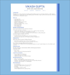
1. Resume Formatting Mistake: Inconsistent Fonts & Sizes – How to Fix It
The Issue:
Some of the most frequently made mistakes in resume formatting reflect font inconsistency and size inconsistency. Combining different fonts or sizes can disorganize your resume and make it appear unprofessional. For example, if you use Arial for the headers and Times New Roman for the body text, there is a visual clash that can detract the reader’s focus from the pertinent information.
How to Fix It:
- A consistent font style enhances readability; opt for professional fonts like Arial, Calibri, or Helvetica.
- Font size matters—keep body text between 10.5 and 12 points, with slightly larger headings (14–16 points) for clarity.
- Use bold and italics sparingly; excessive emphasis can make the resume look cluttered.
2. Avoid These Resume Formatting Mistakes in Headers & Bullet Points

The Issue:
Headers and bullet points summarize key details, making your resume easier to read. Some job seekers misplace them, unfortunately, and you can find resumes that are rather badly readable. For instance, consider the section titled `Experience’. It could have that leader in an extremely large font hovering over a ton of bullet points to Johnson and field, forming a cluttered appearance.
How to Fix It:
- Use headers to organize content: Ensure each section of your resume (e.g., “Experience,” “Education,” “Skills”) has a clearly defined header.
- Maintain consistency: Maintain consistency in font style, size, and formatting across all headers. This creates a cohesive flow and ensures ease of reading.
- Limit the use of bullet points: Bullet points should only be used for listing achievements, responsibilities, or skills. Keep bullet points concise, and ideally, limit them to 3-6 per section.
- Action verbs for bullet points: Start each bullet point with a strong action verb (e.g., “Managed,” “Developed,” “Led”) to convey your accomplishments in a dynamic way.
3. Misalignment: A Critical Resume Formatting Mistake

The Issue:
Text alignment is another important thing to check for sufficient tidiness and professional appearance. When a piece of text, a section title, or something else is not well-aligned with another, the reader gets a visual of a messy document. For example, too much misalignment between the job titles and the respective company names in the `Experience’ section will make it difficult for the reader to get that information at a quick glance.
How to Fix It:
- Use tabs or table formatting: These tools will ensure that elements such as job titles, company names, and dates are properly aligned in a visually appealing way.
- Consistent spacing: Ensure there is equal spacing between sections and elements. This will help the reader digest information easily without feeling overwhelmed.
- Right alignment for dates: Align dates to the right-hand side of the page for a cleaner, more organized look.
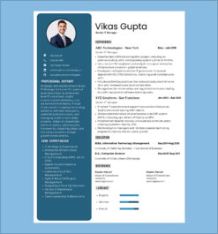
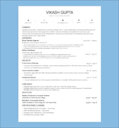
4. How Much White Space Should Your Resume Have?

The Issue:
White space is often overlooked. Too little makes a resume look cramped, while too much can seem empty or unprofessional. The right use of white space allows the text to breathe, contributing to readability and beauty.
How to Fix It:
- Adequate margins: Stick to 1-inch margins on all sides to create a well-balanced page.
- Spacing between sections: Leave enough room between different sections (e.g., “Education” and “Experience”) to create clear boundaries. Aim for 1.5–2 line spacing for body text.
- Paragraph spacing: Use spacing to separate sections and paragraphs, ensuring that the resume doesn’t feel overcrowded or too sparse.
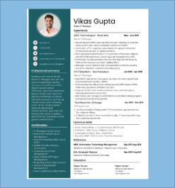
5. Improper Use of Sections: A Common Resume Formatting Mistake
The Issue:
Unorganized sections will simply make things hard to find for recruiters. For example, putting personal hobbies in the “Skills” section as opposed to creating a separate “Hobbies” section would confuse the reader.
How to Fix It:
- Organize your resume into clear sections: Ensure your resume has distinct sections such as “Contact Information,” “Objective,” “Experience,” “Skills,” “Education,” and “Certifications.”
- Remove irrelevant personal information: Unless specifically requested, avoid including irrelevant details like age, marital status, or religion.
- Tailor sections to the job: Focus on what is most relevant to the job you’re applying for. For example, if you have many certifications, dedicate a separate section for them.
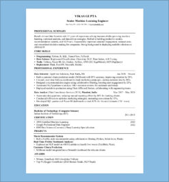
6. Inconsistent Section Headers: A Resume Formatting Mistake You Must Fix

The Issue:
Such inconsistencies in headers might pose a hindrance for hiring professionals while going through your resume. For instance, confusion could arise if one section is termed “Work Experience” and another “Professional Experience,” which might disturb the flow of the resume.
How to Fix It:
- Standardize your headers: Use uniform section titles throughout your resume, such as “Work Experience” and “Education,” instead of mixing terms like “Professional Experience.”
- Be clear and concise: Choose clear, industry-standard titles for your sections to ensure they are universally understood.
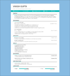
7. ATS-Friendly Formatting: Avoid This Resume Formatting Mistake
The Issue:
Some resumes tend to favour dynamic fonts, colors, and images that might look great but there are some weak points when it comes to Applicant Tracking Systems (ATS). In other words, due to the non-compliance with ATS, you’d risk not having some chances at the job even when you are fully qualified.
How to Fix It:
- Simplify the design: Stick to a clean, simple layout using standard fonts like Arial or Calibri.
- Avoid graphics and tables: These elements can confuse ATS software, which may fail to extract key information from your resume.
- Use relevant keywords: Ensure your resume includes keywords from the job description so that ATS can easily match your qualifications to the job posting.
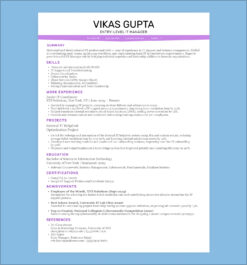
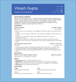
8. Resume Formatting Mistakes: Outdated or Overly Complex Templates

The Issue:
Some job applicants use outdated or overly complicated resume templates with way too much design and offer distractions from the content. Such templates can make the resume difficult to read and could scramble ATS compatibility.
How to Fix It:
- Opt for a minimalist design: Choose a modern, simple template that focuses on clarity and readability.
- Avoid using too many design elements: Keep the use of colors and graphics to a minimum so that your qualifications take center stage.
Conclusion
A well-formatted resume helps you create a strong first impression with employers. Poorly formatted resumes will mean that even the most spectacular credentials could go unnoticed. Conversely, structured presentations help gain an edge in a highly competitive market. Avoiding all the cliche errors in formatting, such as consistent fonts, level headers, and space between whites, can spur your probability of impressing a hiring manager.
You should try out all the formatting suggestions as you work through your resume. A well-formatted resume highlights your skills and experience while ensuring a strong first impression.
Call-to-Action
Your dream job starts with the perfect resume! Avoid common formatting mistakes and make your resume ATS-friendly now. LookingForResume.com“
FAQs
1. What are the most common resume mistakes to avoid in 2025?
Common resume mistakes in 2025 include typos, generic language, keyword stuffing, improper formatting, and not tailoring your resume to the job description.
2. Which resume format is best for ATS in 2025?
The reverse-chronological format is the most ATS-friendly in 2025. It highlights recent experience and uses simple formatting that ATS can easily scan.
3. How can I make sure my resume passes ATS screening?
Use a clean layout, standard fonts like Arial or Calibri, include relevant keywords from the job description, and save your resume as a .docx or .pdf file.
4. What is the ideal resume margin size for ATS compatibility?
Set your resume margins between 0.5 to 1 inch on all sides to ensure readability and ATS compatibility without affecting layout.
5. Should I use graphics or icons in my resume?
Avoid using graphics, icons, or complex tables, as most ATS systems can’t read them. Stick to plain text formatting for best results.
lfr
Build Your Resume Effortlessly with Our Professional Templates
Create your resume easily with our resume builder
and professional templates.