Resume Guide
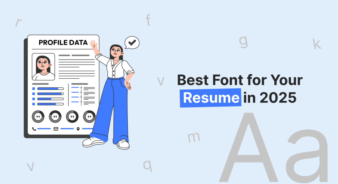
Best Resume Fonts for 2026 (ATS-Friendly & Professional)
Feb
In 2026, most resumes are first scanned by Applicant Tracking Systems (ATS) before a recruiter ever sees them. The font you choose can directly affect whether your resume is readable, professional, and ATS-compatible, or filtered out early.
Hiring managers spend only a few seconds scanning each resume, which makes font clarity and structure critical. A clean, ATS-friendly font helps recruiters quickly understand your experience, while poor font choices can make even strong resumes hard to read or ignore.
This guide explains the best resume fonts for 2026, including ATS-approved options, recommended font sizes, and fonts to avoid. It’s designed for US job seekers, freshers, professionals, and career changers who want their resumes to pass ATS scans and look professional to recruiters.
The most reliable ATS-friendly resume fonts in 2026 are Calibri, Arial, Georgia, Lato, and Verdana. These fonts parse correctly across major Applicant Tracking Systems including Workday, Greenhouse, Taleo, and iCIMS, but compatibility also depends on font weight, whether you are submitting a DOCX or PDF, and which platform you used to build your resume. A font that is ATS-safe in Microsoft Word may behave differently when exported from Google Docs. The full breakdown below covers per-font ATS ratings, recommended sizes for each resume section, platform availability, and the fonts that most frequently cause parsing failures.
Once you have chosen the right font, pair it with one of our [ATS-friendly resume templates] to ensure your layout passes ATS parsing as reliably as your font does.
Best ATS-Friendly Resume Fonts for 2026 (Quick List)
If your resume is being submitted online, using an ATS-friendly font is essential. These fonts are easy for Applicant Tracking Systems to scan and are also preferred by recruiters for clarity and professionalism.
• Arial: One of the safest ATS-friendly fonts, widely accepted across US corporate roles
• Calibri: Modern, clean, and highly readable; ideal for professional and tech resumes
• Times New Roman: Best for legal, finance, and academic resumes that require a traditional look
• Georgia : A readable serif font that performs well in ATS scans and longer resumes
• Helvetica: Clean and professional; works well for design and marketing roles when used carefully
Once you’ve chosen the right font, applying it to a clean layout matters just as much, using professionally designed resume templates can help ensure ATS compatibility and readability.
Why Font Matters in Your Resume?
The selection of a font goes beyond aesthetics; it carries with it psychological traits that govern how your resume is perceived. Here are the top reasons why the choice of font matters:
How Resume Fonts Impact Hiring Managers’ Decisions
First impression indeed does count in hiring. A hiring manager reviews the resume of which they will always form an opinion about you even before meeting face to face with you. Organized and highly professional fonts have a certain characteristic of neatness and quality to them. For example, an uncommon or difficult font may be suggestive of overthinking or that perhaps you do not understand the basic fundamentals of the presentation of professionalism.
How Font Choice Affects Resume Readability
Many hiring managers only scan resumes, especially when they have to go through a bunch in one day. Selecting a readable font ensures that your qualifications and experience are noticeable without any visual clutter. Readability is paramount-if the font is too decorative, too tiny, or not legible, your resume will get tossed onto the pile before it gets an honest look.
How Fonts Influence First Impressions on Your Resume
Every time someone opens and looks at your resume, often, that is the first impression people will get of your work. The choice in font impacts how professionally that first impression reads and shows an eye for detail. Think about an old, awkward font used for a resume-not very professional looking. Instead, it might say, “I did not bother to pick a better font.”
Top 10 Resume Fonts for 2026
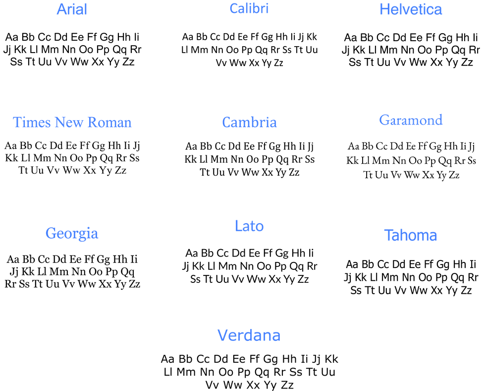
1. Arial
ATS Compatibility: High
Best for: Corporate, administrative, finance, government, and general professional roles
Recommended size: 11pt body, 13pt section headings
Available in: Microsoft Word (built-in), Google Docs (native), PDF-safe
Arial is one of the most universally safe resume fonts available. It uses standard character encoding that parses without errors across all major ATS platforms including Workday, Greenhouse, Taleo, iCIMS, and Lever. Its letterforms are clean and widely spaced, making it easy to read at smaller sizes without sacrificing clarity. Arial is particularly reliable when submitting resumes in DOCX format, as it is a system font on both Windows and Mac.
Verdict: The safest all-purpose choice, if you are unsure which font to use, Arial will not fail you in any industry or ATS system.
2. Calibri
ATS Compatibility: High
Best for: Tech, corporate, finance, SaaS, and administrative roles
Recommended size: 11pt body, 13pt section headings
Available in: Microsoft Word (default), Google Docs (via Google Fonts add-on), PDF-safe
Calibri has been the Microsoft Word default since 2007, making it the most frequently seen resume font by recruiters in corporate environments. Its rounded letterforms and open spacing make it highly readable on screen and in print. It parses cleanly in Workday, Greenhouse, and iCIMS when submitted as either DOCX or PDF. Note that Calibri is not a native Google Docs font — if you are building your resume in Google Docs, you will need to install it via the Google Fonts add-on or use Arial as an equivalent alternative.
Verdict: The most recruiter-familiar font for corporate and tech roles, a reliable default that signals professionalism without calling attention to itself.
3. Helvetica
ATS Compatibility: High
Best for: Design, marketing, advertising, creative agencies, and tech startups
Recommended size: 11pt body, 13pt section headings
Available in: Mac (built-in), not available in Windows Word or Google Docs natively, PDF-safe
Helvetica is a clean, modern sans-serif with strong visual appeal in design and marketing contexts. It parses correctly in ATS systems when submitted as a PDF with fonts properly embedded. However, it is a Mac-exclusive font and is not available in Microsoft Word on Windows or in Google Docs. If a hiring manager opens your Word file on a Windows machine, Helvetica will be substituted with a system font, typically Arial, which can alter your resume’s layout. For consistent cross-platform rendering, submit Helvetica resumes as PDFs only.
Verdict: Excellent for design and creative roles on Mac, always submit as PDF to prevent font substitution on Windows systems.
4. Times New Roman
ATS Compatibility: High
Best for: Law, finance, academia, government, and traditional corporate sectors
Recommended size: 12pt body, 14pt section headings
Available in: Microsoft Word (built-in), Google Docs (native), PDF-safe
Times New Roman is one of the oldest and most universally supported fonts in existence. It parses with zero errors across all ATS platforms and is considered the standard professional font in legal, academic, and financial sectors. At 12pt it is highly readable for dense content such as legal experience or publication lists. While it carries a traditional appearance that may feel dated in tech or startup environments, it remains the expected choice in sectors where formality signals credibility.
Verdict: The standard for legal, academic, and financial resumes, choose this when the industry culture explicitly values tradition over modernity.
5. Cambria
ATS Compatibility: High
Best for: Finance, consulting, healthcare, education, and formal corporate roles
Recommended size: 11pt body, 13pt section headings
Available in: Microsoft Word (built-in), Google Docs (limited availability), PDF-safe
Cambria is a serif font designed specifically for on-screen readability, which makes it a more modern alternative to Times New Roman without sacrificing formality. It parses reliably in ATS systems and is particularly effective for resumes with dense content, its slightly wider letter spacing at 11pt prevents the cramped appearance that can occur with Times New Roman at the same size. Cambria is not always available in Google Docs; if building your resume there, verify the font renders correctly before downloading.
Verdict: The best traditional serif option for professionals who want a formal look with better screen readability than Times New Roman.
6. Garamond
ATS Compatibility: Medium
Best for: Creative writing, publishing, humanities academia, communications, and marketing
Recommended size: 11.5pt body, 13pt section headings (requires slightly larger size for ATS reliability)
Available in: Microsoft Word (built-in), Google Docs (native), PDF-safe
Garamond is an elegant serif typeface with roots in 16th-century typography. It brings a refined, literary quality to resumes that suits creative and academic fields. Its ATS compatibility is rated medium because at standard sizes (10–11pt), Garamond’s lighter stroke weight can cause reduced confidence in character recognition in some older ATS systems. Use it at 11.5pt minimum to ensure reliable parsing. It is best reserved for industries where aesthetic presentation carries weight alongside technical qualifications.
Verdict: A strong choice for creative, academic, and communications roles, use at 11.5pt or above and always submit as PDF with fonts embedded.
7. Georgia
ATS Compatibility: High
Best for: Content writing, journalism, education, marketing, consulting, and general professional roles
Recommended size: 11pt body, 13pt section headings
Available in: Microsoft Word (built-in), Google Docs (native), PDF-safe
Georgia was originally designed by Microsoft for on-screen readability, which gives it a natural advantage over older serif fonts in digital environments. It parses cleanly across all major ATS platforms and is one of the few serif fonts that reads well at both small print sizes and on screen without strain. Its wider letterforms make it a good choice for resumes that need to fill a page without appearing padded. Georgia is a reliable alternative to Times New Roman for professionals who want a traditional serif look that feels slightly more contemporary.
Verdict: The best ATS-safe serif font for modern professional resumes, looks formal without appearing dated.
8. Lato
ATS Compatibility: High
Best for: Marketing, tech, product management, UX, and startup environments
Recommended size: 11pt body, 13pt section headings
Available in: Microsoft Word (via download), Google Docs (native), PDF-safe
Lato is a modern sans-serif typeface designed with both print and screen readability in mind. It is a native font in Google Docs, making it the recommended choice for job seekers who build and submit resumes directly from Google Docs without installing additional fonts. It parses correctly in all major ATS platforms when submitted as PDF or DOCX. Lato’s semi-rounded letterforms give it a professional but approachable quality that fits well in modern tech and startup cultures where Arial or Calibri may feel too generic.
Verdict: The top choice for Google Docs users and tech or startup applicants who want ATS safety with a more distinctive visual tone.
9. Tahoma
ATS Compatibility: High
Best for: Corporate, administrative, IT support, and general professional roles
Recommended size: 11pt body, 13pt section headings
Available in: Microsoft Word (built-in), Google Docs (limited), PDF-safe
Tahoma is a clean sans-serif font with slightly wider letter spacing than Arial, giving resumes a more open and easy-to-scan appearance. It was originally designed for Windows user interfaces, which means it performs consistently in Windows-based environments and DOCX submissions. It parses cleanly in ATS systems and is a reliable choice for professionals in corporate or IT roles who want a neat, structured appearance without using the more commonly seen Arial or Calibri. Tahoma is not widely available in Google Docs, verify availability before using it in that environment.
Verdict: A solid secondary sans-serif option for corporate and IT resumes when you want to avoid the ubiquity of Arial or Calibri.
10. Verdana
ATS Compatibility: High
Best for: Tech, IT, data roles, remote job applications, and digital-first submissions
Recommended size: 10.5pt body, 12pt section headings (slightly wider font, use smaller size to manage spacing)
Available in: Microsoft Word (built-in), Google Docs (native), PDF-safe
Verdana was designed specifically for screen readability at small sizes, which makes it one of the most legible fonts when resumes are reviewed digitally, the primary mode of resume review in 2026. Its wider character width means it occupies more horizontal space than Arial or Calibri, so use 10.5pt body text to maintain a clean single-page layout. It parses correctly in all ATS platforms. Verdana is particularly effective for tech and data resumes where content density is high and readability at small sizes is critical.
Verdict: The best choice for screen-first, digital-submission resumes, especially strong for tech, data, and IT roles where hiring happens entirely online.
How ATS Systems Read and Parse Resume Fonts
Before a recruiter ever opens your resume, an Applicant Tracking System scans it, extracts the text, and indexes your content against job description keywords. The font you use directly affects whether that extraction succeeds. A font that is visually clean to a human reader can still cause character-level parsing errors in ATS software, silently stripping keywords from your application before any human sees it.
How ATS Text Extraction Actually Works
ATS platforms extract resume content in one of two ways depending on your file format.
When you submit a DOCX file, the ATS reads the XML structure of the document directly. It accesses your text as raw data, independent of how it visually renders. Standard system fonts – Arial, Calibri, Georgia, Verdana, are recognized immediately. Custom or downloaded fonts that are not part of the standard font library can cause the system to misread character encoding, producing garbled text or dropping words entirely.
When you submit a PDF file, the ATS reads the text layer embedded in the document. If your font is properly embedded in the PDF, the text layer is complete and parsing works correctly. If the font is not embedded, which can happen with custom or licensed fonts, the ATS either attempts character recognition from the visual rendering or fails to extract the text entirely. This is why custom fonts that look professional in a PDF can completely fail ATS parsing behind the scenes.
What Happens When a Font Fails ATS Parsing
Font-related parsing failures are not visible to the applicant. You will not receive an error. Your application will appear submitted. But the ATS will have indexed incomplete or corrupted data, which means your keywords, skills, job titles, certifications, may not match against the job description requirements.
Common failure modes caused by problematic fonts:
- Character substitution: decorative or script fonts cause individual characters to be misread. An “f” in a script font may be extracted as a different character, breaking keyword matches silently.
- Text extraction failure: custom fonts not embedded in PDFs are either skipped or converted to symbols, making entire sections invisible to the ATS index.
- Spacing misreads: ultra-condensed or ultra-light font weights can cause words to be merged or split during extraction, corrupting phrases like “project manager” into “projectmanager” or “project man ager.”
- Font substitution layout breaks: if a non-standard font is substituted by the ATS rendering engine, text reflow can push content outside expected field boundaries, causing section misclassification.
Font-related issues are one of several formatting problems that cause ATS rejection, see our full guide on [common ATS resume formatting mistakes] to audit your resume beyond font choice.
ATS Platform-Specific Font Behaviour
Major ATS platforms handle resume parsing differently. Here is how the most widely used systems behave with font choices:
Workday: Widely used in enterprise and Fortune 500 hiring. Handles DOCX files reliably with all standard fonts. PDF parsing is strong but custom font embedding must be verified. Calibri, Arial, and Georgia all parse without issues.
Greenhouse: Common in tech and startup hiring. Strong PDF and DOCX parsing. Performs well with Google Docs-native fonts including Lato and Arial. Calibri requires the DOCX format or a properly embedded PDF for reliable extraction.
Taleo: Used extensively in large corporate and government hiring. One of the older ATS platforms in active use. Has more conservative font handling – stick to Arial, Times New Roman, or Calibri for maximum compatibility. Avoid any font below 10pt as Taleo’s character recognition degrades at very small sizes.
iCIMS: Common in mid-market corporate hiring. Reliable parsing for all top 10 fonts listed in this guide. Handles both DOCX and PDF well when standard fonts are used. Custom fonts present the same embedding risks as other platforms.
Lever: Popular in modern tech and growth-stage company hiring. Strong HTML and PDF parsing. Less sensitive to font choice than older platforms, but still performs best with standard system fonts in the 10–12pt range.
The Three Font Rules That Guarantee ATS Compatibility
Regardless of which font you choose from the recommended list above, these three rules apply universally across all ATS platforms:
Rule 1: Use a standard system font. Fonts that ship with Windows or Mac by default, or that are native to Google Docs, are indexed in every ATS font library. Custom downloaded fonts are not.
Rule 2: Stay within the 10–12pt range for body text. ATS text extraction confidence decreases at sizes below 10pt. At 9pt or smaller, some platforms produce character misreads even with ATS-safe fonts.
Rule 3: If submitting as PDF, verify fonts are embedded. In Microsoft Word: File → Save As → PDF Options → check “Embed fonts in the file.” In Google Docs: fonts that are native to Google Docs embed automatically on download.
Resume Font Compatibility by Platform — Word, Google Docs, and PDF
The font you choose must be available on the platform you use to build your resume. A font that displays correctly in Microsoft Word may not exist in Google Docs. A font that looks perfect on your screen may not embed correctly when you export to PDF. The table below shows availability and ATS compatibility for every font covered in this guide, plus three additional fonts that appear frequently in resume-related searches.
Font Availability and ATS Compatibility Table
| Font | Microsoft Word | Google Docs | PDF Embed | ATS Rating | Best Submission Format |
|---|---|---|---|---|---|
| Calibri | Yes — default | Via add-on only | Yes | High | DOCX or PDF |
| Arial | Yes — built-in | Yes — native | Yes | High | DOCX or PDF |
| Georgia | Yes — built-in | Yes — native | Yes | High | DOCX or PDF |
| Lato | Via download | Yes — native | Yes | High | PDF preferred |
| Verdana | Yes — built-in | Yes — native | Yes | High | DOCX or PDF |
| Times New Roman | Yes — built-in | Yes — native | Yes | High | DOCX or PDF |
| Cambria | Yes — built-in | Limited | Yes | High | DOCX preferred |
| Garamond | Yes — built-in | Yes — native | Yes | Medium | PDF at 11.5pt+ |
| Tahoma | Yes — built-in | Limited | Yes | High | DOCX preferred |
| Helvetica | Mac only | Not available | Yes | High | PDF only |
| Source Sans Pro | Via download | Yes — native | Yes | High | PDF preferred |
| Open Sans | Via download | Yes — native | Yes | High | DOCX or PDF |
| Roboto | Via download | Yes — native | Yes | High | PDF preferred |
How to Read This Table
Microsoft Word availability means the font is installed by default on Windows or Mac without downloading anything. Fonts marked “Via download” require you to install them manually before they appear in Word.
Google Docs availability means the font appears in the Google Docs font menu without adding anything. Fonts marked “Via add-on” require installing through the Google Fonts add-on (Extensions → Add-ons → Get add-ons → search font name). Fonts marked “Limited” may appear on some accounts but not others depending on browser and regional settings.
PDF Embed confirms whether the font embeds correctly when you export to PDF from that platform. All fonts in this table embed reliably when exported as PDF from Microsoft Word with the “Embed fonts” option enabled, or when downloaded as PDF from Google Docs using a native Google font.
Platform-Specific Guidance
Microsoft Word Users
All fonts marked “Yes, built-in” are available immediately with no setup. For Lato, Source Sans Pro, Open Sans, or Roboto, install via the Microsoft Store or download from Google Fonts and install to your system fonts folder. Once installed, they appear in Word automatically.
When saving as PDF from Word: go to File → Save As → More Options → Tools → Save Options and check “Embed fonts in the file.” This ensures fonts render correctly when the ATS extracts text from your PDF.
Google Docs Users
Google Docs has the strongest native library for modern sans-serif fonts. Lato, Open Sans, Roboto, Arial, Georgia, Verdana, and Times New Roman are all available without any setup. Calibri is not native, use Lato or Arial as direct ATS-equivalent alternatives if you prefer to work in Google Docs without installing add-ons.
For a complete checklist of ATS optimization beyond font and platform, read our guide on [how to optimize your resume for ATS].
When downloading from Google Docs as PDF: native fonts embed automatically. No additional steps needed. Download as File → Download → PDF Document (.pdf).
PDF Submission Tips
- Always submit PDF when using Helvetica, it is Mac-only and will substitute to Arial on Windows if submitted as DOCX
- For Garamond, use PDF at 11.5pt minimum, smaller sizes reduce ATS parsing confidence
- For all other fonts in the table, DOCX and PDF both perform reliably
Three Additional ATS-Safe Fonts Not in the Top 10
These fonts appear frequently in resume font searches and are fully ATS-compatible but were not included in the main Top 10 list. They are worth considering depending on your platform and industry.
Source Sans Pro
ATS Compatibility: High
Best for: Tech, UX, product, and design roles
Recommended size: 11pt body, 13pt section headings
Available in: Microsoft Word (via download), Google Docs (native)
Source Sans Pro is an open-source sans-serif typeface developed by Adobe and released via Google Fonts. It is native to Google Docs and parses cleanly in all major ATS platforms. Its clean geometric structure and open letterforms make it particularly well-suited for tech and product resumes where you want a modern, distinct appearance without the ubiquity of Arial or Calibri. It is one of the most commonly queried ATS-safe alternatives to Calibri for Google Docs users.
Verdict: The best ATS-safe alternative to Calibri for Google Docs users in tech and product roles.
Open Sans
ATS Compatibility: High
Best for: Marketing, operations, healthcare, education, and general professional roles
Recommended size: 11pt body, 13pt section headings
Available in: Microsoft Word (via download), Google Docs (native)
Open Sans was designed specifically for screen legibility and is one of the most widely used fonts on the web. It is native to Google Docs and embeds cleanly in PDF exports. Its neutral, open letterforms make it versatile across industries — it carries none of the corporate familiarity of Arial but is equally ATS-safe. Open Sans works particularly well for resumes with a mix of text-heavy sections and skill lists where visual breathing room improves scannability.
Verdict: A versatile, screen-optimized alternative to Arial for Google Docs users across most professional industries.
Roboto
ATS Compatibility: High
Best for: Engineering, software development, data science, and IT roles
Recommended size: 11pt body, 13pt section headings
Available in: Microsoft Word (via download), Google Docs (native)
Roboto is Google’s primary typeface and is native to Google Docs. It was designed for Android interfaces, which means it is optimized for on-screen readability at small sizes, a direct advantage for resumes reviewed digitally. It parses without errors in all major ATS platforms when submitted as PDF from Google Docs. Its technical, structured appearance is well-matched to engineering and software development resumes where precision signals matter.
Verdict: The top choice for software engineers and data professionals building resumes in Google Docs who want ATS reliability with a clean, technical aesthetic.
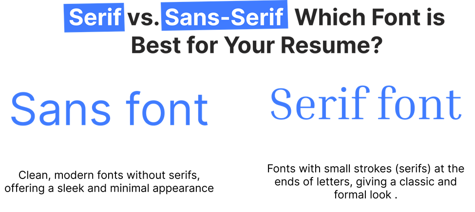
Serif vs. Sans-Serif: Which Font is Best for Your Resume?
During writing of resumes, you encounter “serif” and “sans-serif” fonts. What are serif and sans-serif fonts and which one will be good for your resume?
Serif Fonts
Serif fonts are marked by small decorative lines called “serifs” at the end of their strokes. They tend to be formal in nature and are mainly used for print. Examples of serif fonts include Times New Roman and Garamond. These will give your resume a classic, formal look ideal for law, academics, and finance practices.
Sans-Serif Fonts
Sans-serif fonts have no extra lines at the edges of their strokes. They seem to be newly printed and streamlined. Examples for sans-serif include Arial, Calibri, Helvetica. These are the most suggested typefaces by the tech, marketing, and design industries which are more about being modern and clean.
Which One Should You Choose?
Both these are great fonts for resumes, but your decision will entirely depend on the type of industry you’re looking to get hired into. If you’re in creative industries, then Helvetica or Lato would be the better sans-serif font. In legal or financial fields, for example, Times New Roman will be the better choice.
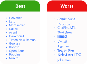
Fonts to Avoid on Your Resume
Even with the best qualifications, a wrong choice of font can make your resume look unprofessional. Here are some fonts to avoid:
Comic Sans
The widely absurd Comic Sans should never appear on your resume. It is playful and informal, often associated with casual projects rather than professional ones. To project professionalism, opt for more neutral fonts.
Papyrus
It is a little artsy, but it is an older font and is used more loosely. It does not work too great with resumes, as it tends to subdue the professional aspect of your application.
Curlz MT
If you wish to attract attention, Curlz MT will certainly attract attention-but to the wrong end. It just looks so awkward, illegible, and so unprofessional. There are ways of attracting more attention: possibly highlighting your credentials rather than your font.
The Best Font Size for Your Resume
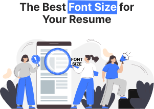
The ideal font size for your resume is very important. The right size will ensure that your resume will be readable and have all the details in the document. If the text is too small, hiring managers will not be able to read your qualifications. On the other hand, if it’s too large, it looks unprofessional and wastes precious space on it. Ideal Font Sizes for Different Sections:
Ideal Font Sizes for Different Sections:
1. Header (Name & Contact Information): Your name is the first thing a recruiter will notice. Make sure that it is truly the first, so set your name in text size around 18–22 points. Other contact information, such as phone, email, and LinkedIn, is often set below your name and is acceptable at sizes of 10–12 points.
2. Headings (e.g., Professional Experience, Education): Headings only-may be in the same size and font as the body text. A font size of 12–14 points should do the trick-for it should be large enough to get attention without mess and disarray.
3. Body (Job Descriptions, Skills, etc.): The word count ideal for the body section is 10–12. Any less will strain the reader’s eyes, and any more will use up too much space and dilute the impact of your resume’s content.
4 . Subheadings or Minor Sections (Skills, Certifications): 10.5–11 points, a bit smaller than your body text. This will keep sub-sections from overwhelming more important content, yet still seem organized.
5 . Balancing Readability and Space: You want to achieve a balance between making it readable and all your information fitting onto one page, or two, if necessary. Use body text in anything smaller than 8 or 9 points; it makes your resume really hard to read, which is the opposite of what you want when trying to grab at the reader.
6. Formatting Tips for Font Size: Here’s how you can make your font size work for you:
- Consistency is Key: Keep the same font size for similar sections.
- White Space is Valuable: Avoid filling the page with text. Proper use of white space allows the reader to navigate your resume easily and creates room for the important sections to shine.
How to Match Your Resume Font with the Industry
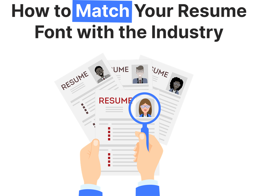
When selecting a font, it’s important to consider how it fits within your industry. Each sector has its own standards regarding what is judged professional or creative. By aligning your font choice with the industry you’re targeting, you show that you grasp the culture and expectations of that field.
1. Creative Industries (Design, Advertising, Media):
In creative industry sectors for a resume, there is every license to push a little to a more artist or even eloquent take it’s still quite tasteful while retaining creativity or personality. Now the modern art or artistic but with no sacrosanct feel for reader comfort can best be achieved, such as is done by, with Helvetica and Futura along with Garamond. While for slick-look modern touch, Lato shines.
2. Corporate and Financial Sectors:
The world of the corporate office is very elegant and well-groomed. Times New Roman, Arial, and Calibri are staple fonts. Traditional fonts used speak of knowledge and gravity.
Example: A corporate lawyer could use Times New Roman in size 12 for the main text of their resume, with Arial or Calibri for headings to introduce a modern touch.
3. Tech Industry:
For the tech industry, simplicity and clarity are always preferred. Clean, modern fonts like Verdana or Tahoma are perfect for this reason. These are readable even at smaller sizes, which makes them perfect for coding or technical resumes.
Example: A software engineer might choose Verdana for readability and maintain consistent formatting to emphasize his coding skills.
4. Healthcare and Education:
In healthcare or education, the professional font has to be readable. Best options include Cambria, Georgia, and Arial since they seem professional but not so stiff or formal.
Example: A nurse may choose a very readable and approachable font to make reading her resume pretty easy.
Best Fonts for a Resume: How to Choose the Right One
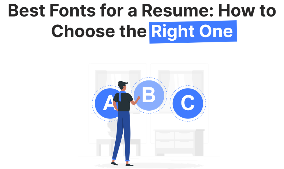
You have to choose the best font for your resume. Though it should look attractive, it should also be readable and aligned. A good font makes your resume scannable and readable to both human eyes and the Applicant Tracking Systems (ATS), most of which filter what reaches the recruiter at their end.
1. Select a readable font-Need for clarity:
The first and most critical role of a resume font is that it should be readable. The more decorative the font, no matter how beautiful or intricate it may look, the more confusing to the reader, or just too hard to decipher, it is. Instead, go for something clear and readable. The basic fonts that are perfect include Calibri, Arial, and Georgia.
2. Professionalism – The Font Should Reflect Professionalism:
Consider a resume as the presentation of professional identity. An appropriate font reflects the right impression. Though old-fashioned, Times New Roman still is considered extremely professional in a lot of professions. Helvetica works well for those who are trendy and new and want to showcase their tech business or startup companies.
3. Ensure Compatibility with ATS (Applicant Tracking Systems):
Many companies use an ATS in which resumes are scanned and culled down to the most relevant candidates through keywords. Some fonts are easier for an ATS than others. Generally, serif such as Times New Roman and Cambria read smoothly to the ATS, while sans-serif such as Arial and Helvetica review pretty easily.
Example: When you are applying online, make sure that you use fonts that do not confuse the ATS. Opt for commonly used fonts such as Arial and Calibri to get maximum compatibility.
Beyond font choice, AI tools can now scan and score your resume against ATS criteria automatically, see our [AI resume optimization guide] for a step-by-step approach.
Resume Formatting Tips: Choosing the Best Font for Readability
Creating a resume that is both visually appealing and functional requires proper formatting. Here are some tips to help you format your resume effectively using the right font:
1. Margins: Target for margins of about 0.5–1 inch. This keeps your resume from feeling cramped while ensuring a tidy look.
2. Spacing: Apply single spacing for the body text and double spacing between sections. This results in a clean and easy-to-read format.
3 . Headers: Use bold or slightly larger font sizes for section headers (12–14 points). This allows recruiters to quickly scan your resume.
4. Consistency: Stick to one font throughout the resume. Using multiple fonts can create a disorganized appearance.
5. Bullet Points: Use bullet points for lists. They enhance readability and help to break up lengthy paragraphs.
After formatting your resume, it’s a good idea to test it using an ATS resume checker to make sure your font and layout are parsed correctly.
For a complete breakdown of margins, spacing, and layout best practices, see our [professional resume formatting tips] guide.
Resume Font Mistakes to Avoid for a Professional Look
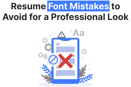
We’ve discussed how to select the right font, but there are several common mistakes that job seekers often make regarding fonts. Avoiding these mistakes can improve your chances of securing an interview.
1. Using Hard-to-Read Fonts: Fonts such as Comic Sans or Papyrus should be completely avoided. They can make your resume appear unprofessional and fail to reflect the seriousness of your qualifications.
2. Inconsistent Font Choices: Changing fonts between sections or using various fonts for emphasis can clutter your resume. It’s best to stick to a single font from start to finish.
3. Too Small or Too Large Font Sizes: Fonts that are too small (below 10 points) can be difficult to read, while excessively large fonts may come off as unprofessional. Target for the suggested sizes for a balanced look.
4. Overuse of Bold and Italics: Although bold and italics can effectively highlight key information, overusing them can be distracting. Use these styles rarely.
How the Right Font Can Set Your Resume Apart
To make your resume noticed, use formatting tools like bold, italics, and varying font sizes to highlight important information.
1. Bold for Emphasis: Use bold to highlight key headings, job titles, and companies to make sure that they grab attention.
2. Italics for Details: Italics can be used for job dates or additional details that are still important but shouldn’t overpower the main text.
3. Different Font Sizes for Hierarchy: Make job titles slightly larger than the body text to show the structure and importance of each section.
Conclusion
In 2026, the right font for your resume will be one that balances readability, professionalism, and practicality. A suitable font will make your resume easy to read, well-organized, and in line with your career aspirations. Always tailor your choice of font to the industry you’re targeting and keep to the formatting guidelines.
A good choice of font will make all the difference by attracting hiring managers to your resume.
Optimize Your Resume Today! Choose the perfect font to boost readability and leave a lasting impression https://lookingforresume.com/
Frequently asked questions
What are the most ATS-friendly resume fonts?
The most ATS-friendly resume fonts in 2026 are Calibri, Arial, Georgia, Lato, and Verdana. These fonts use standard character encoding that all major ATS platforms, including Workday, Greenhouse, Taleo, iCIMS, and Lever, can extract without errors. They are available as system fonts or native platform fonts in both Microsoft Word and Google Docs, and they embed correctly in PDF exports. For maximum ATS reliability, use any of these fonts in Regular or Bold weight at 10.5–11pt for body text.
What font should a resume be in for 2026?
For most job seekers in 2026, Calibri at 11pt for body text is the safest and most widely accepted choice. It is the Microsoft Word default, parses cleanly across all major ATS platforms, and is immediately familiar to recruiters in corporate, tech, and administrative hiring. If you are building your resume in Google Docs, use Lato or Arial instead, both are native to Google Docs and offer the same ATS reliability as Calibri without requiring any add-on installation.
Is Calibri ATS friendly?
Yes. Calibri is one of the most ATS-compatible fonts available and has been the Microsoft Word default since 2007. It parses without errors in Workday, Greenhouse, iCIMS, and Taleo when submitted as DOCX or as a properly exported PDF. The one limitation to know: Calibri is not a native Google Docs font. If you build your resume in Google Docs, you will need to install Calibri via the Google Fonts add-on, or use Lato or Arial as ATS-equivalent alternatives.
What font size is best for a resume in 2026?
Use 10.5 to 11pt for body text, 12 to 14pt for section headings, and 18 to 22pt for your name in the header. These sizes maintain readability for both ATS systems and human reviewers. Do not go below 10pt for any body text, ATS character recognition accuracy decreases at smaller sizes, and recruiters scanning quickly will skip content that requires effort to read. Do not exceed 14pt for section headings as this can make the resume appear unbalanced and uses space inefficiently.
What fonts should I avoid on a resume?
Avoid Comic Sans, Papyrus, Curlz MT, and all script or handwriting fonts, these cause character-level parsing errors in ATS systems because their letterforms do not map to standard character encoding. Also avoid Courier New, which parses correctly but signals outdated formatting to recruiters. Ultra-light or thin font weights, even in ATS-safe font families like Calibri Thin or Helvetica Light, can reduce ATS text extraction confidence and should be avoided. Any custom downloaded font that is not embedded in your PDF presents the same parsing risk as a decorative font.
Does font choice affect ATS scanning?
Yes, directly. ATS systems extract text from your resume file before any human reviews it. Fonts that are non-standard, decorative, or not properly embedded in PDFs can cause character misreads, missing keywords, or complete text extraction failure, none of which produce an error message you would see. In the worst cases, a font-related parsing failure means your skills, job titles, and certifications never match against the job description in the ATS index, causing automatic filtering before a recruiter is involved. Using a standard ATS-compatible font eliminates this risk entirely.
What is the best resume font for Google Docs?
The best ATS-safe fonts native to Google Docs are Lato, Arial, Open Sans, Roboto, Georgia, Verdana, and Times New Roman. Of these, Lato is the strongest all-purpose choice, it combines modern visual appeal with high ATS compatibility and embeds cleanly when you download your resume as PDF from Google Docs. Calibri is not available in Google Docs by default; if you need Calibri specifically, install it via the Google Fonts add-on (Extensions → Add-ons → Get add-ons → search “Calibri”) or use Lato as a direct equivalent.
Can I use Helvetica on my resume?
Yes, but with an important condition. Helvetica is ATS-compatible and looks clean and professional, particularly for design and marketing roles. However, it is a Mac-exclusive font and is not available in Microsoft Word on Windows or in Google Docs. If you submit a Word file using Helvetica and the hiring manager opens it on a Windows machine, the font will substitute, typically to Arial, which can alter your resume layout. Always submit Helvetica resumes as PDF with fonts embedded to prevent substitution. If you are on Windows or using Google Docs, use Arial as the direct ATS-safe equivalent.
lfr
Build Your Resume Effortlessly with Our Professional Templates
Create your resume easily with our resume builder
and professional templates.